See how our services
make an impact.
Starting From Zero: A Research-First Approach to Product Modernization
How Tonic helped transform a client’s legacy compliance tool by listening to its users first.
(All screenshares and photos are anonymized to protect the privacy of our client and their end users.)
Some products are built, shipped, and used for years without anyone ever stopping to ask: does this actually work for the people using it?
When our client, a global data analytics company, came to us with a reporting system used daily by insurance underwriters, analysts, and administrators, the tool was doing its job; but the team had never stopped to ask whether it was working as well as it could for the people using it every day.
Through comprehensive UX research and strategic redesign, we helped the team go from zero user insights to a modernized product with a clear improvement roadmap, one that reduced manual effort, surfaced critical data more intuitively, and established a replicable research framework that other product teams are now actively pursuing.
Here's how we got there.
Starting From Scratch (By Design)
Our engagement began with a full discovery phase. Before sketching a single wireframe, we needed to understand the product from every angle: what users said, what they did, and why the gap between the two mattered.
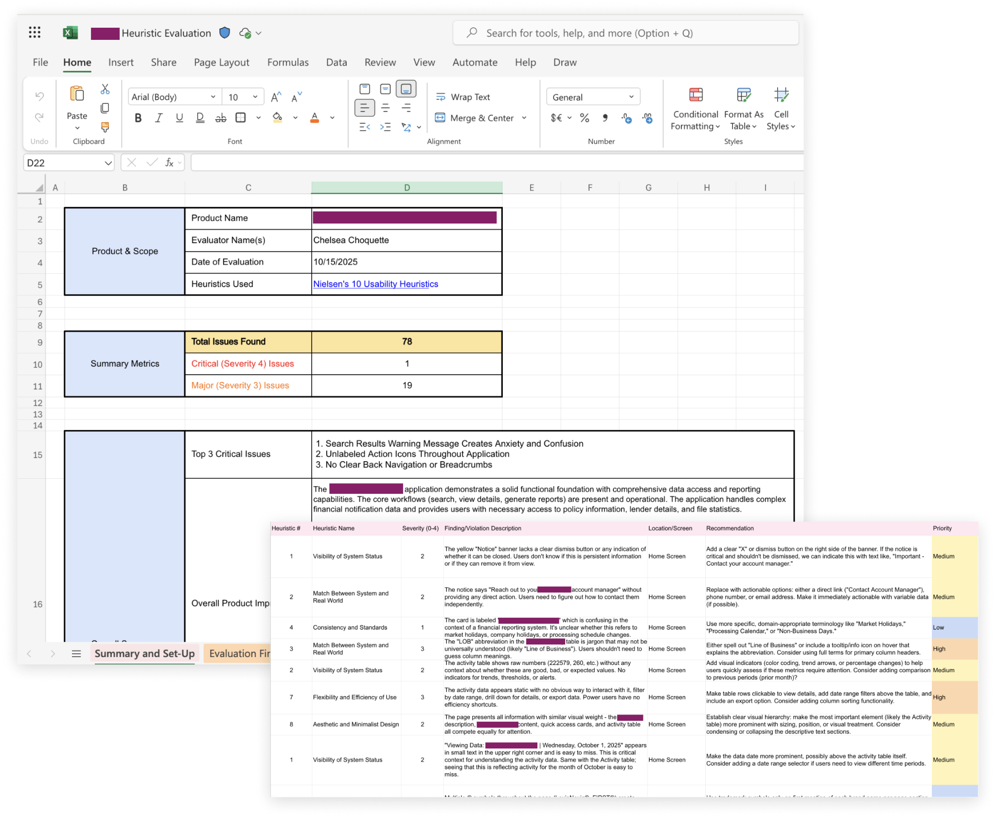
We employed five complementary research methods: a heuristic evaluation, a current-state audit, competitive analysis, in-depth user interviews across four insurance companies, and behavioral analytics via Fullstory. The combination was deliberate; qualitative insights tell you what people feel, but behavioral data shows you what they actually do when no one's watching.
And what we found painted a clear picture.
The Real Cost of "It Works, But..."
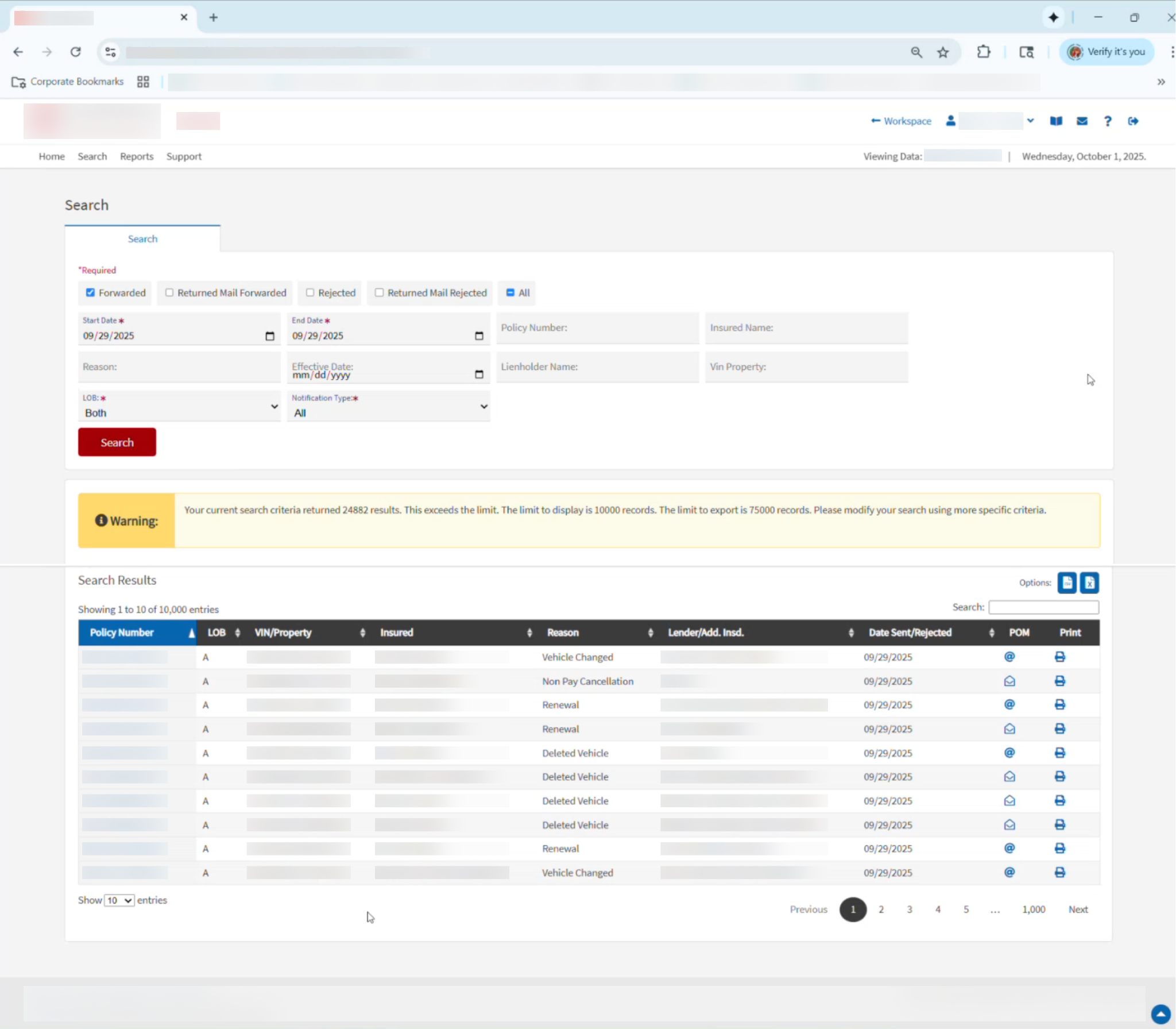
While this tool worked, we found its users struggled to interact with it. Interviews revealed that satisfaction varied widely depending on the complexity of a user's role. Those with simple, transactional tasks generally got what they needed, but power users managing complex workflows told a different story: too many manual steps, too little visibility, and an interface that hadn't kept pace with how they actually worked.
Throughout our research, we discovered deeper workflow bottlenecks that were quietly costing people significant time:
- Unclear menus turned basic navigation into a time sink, even for experienced users.
- Technical constraints forced users out of the system entirely, where they would manually split and reconcile data in Excel just to get a complete picture.
- The same reports ran manually on repeat, consuming time that could have been spent on more meaningful work.
- Critical data and insights were buried behind multiple clicks, forcing users to hunt for information rather than act on it.
The behavioral data confirmed it all. Session recordings showed users attempting the same actions repeatedly, bouncing between screens, and clicking on elements that didn't respond the way they expected. The navigation wasn't just frustrating; it created real cognitive load and wasted hours for users.
Designing Solutions That Match Real Problems
With a clear picture of the pain points, we moved into a collaborative prioritization phase with the client’s product and development teams. We identified the highest-impact near-term improvements without losing sight of the longer-term product roadmap.
Our design solutions targeted the root causes directly:
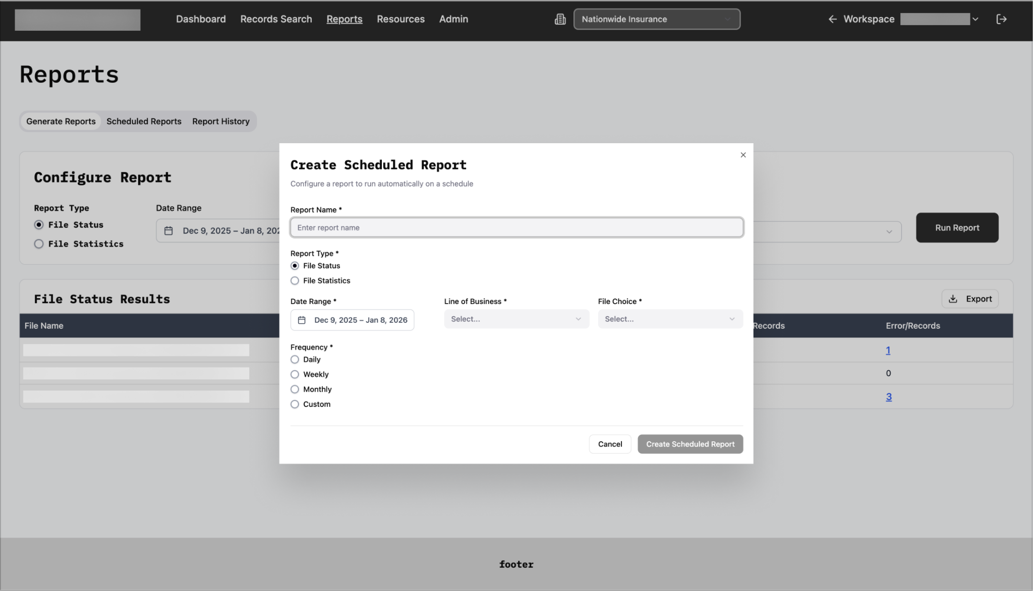
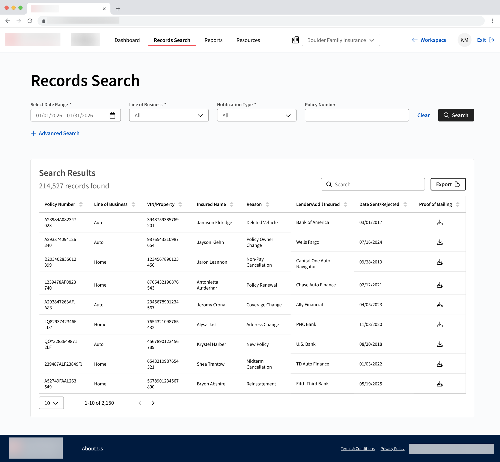
Automated Scheduled Reports eliminated the weekly manual grind by letting users configure reports to run on their chosen cadence and get delivered straight to their inbox. No logging in, no waiting, no forgetting.
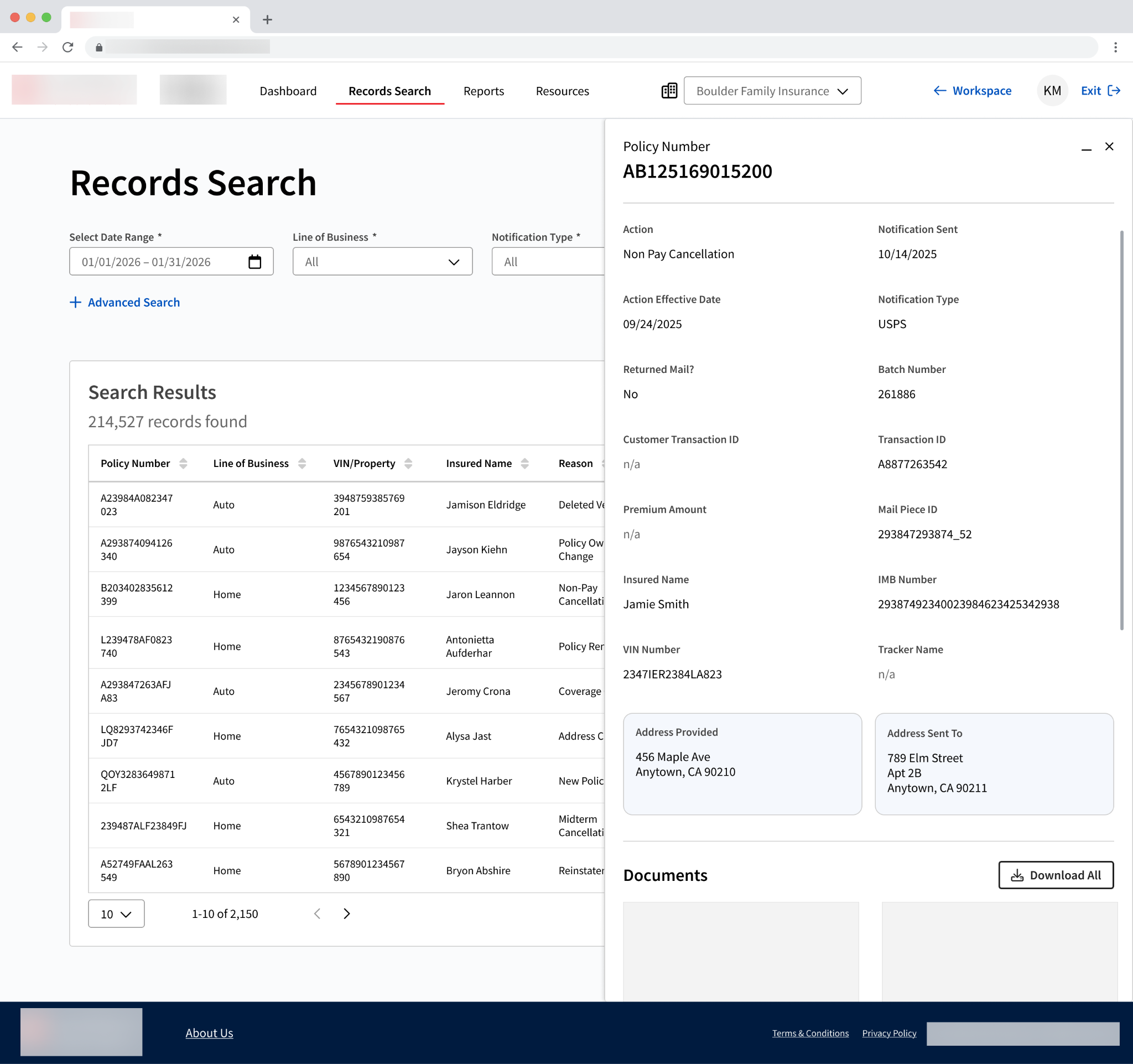
Report Email Delivery eliminated the need to leave the system entirely. By routing exports via email, users could receive complete datasets in one shot. No splitting data, no reconciling in Excel, no babysitting downloads.
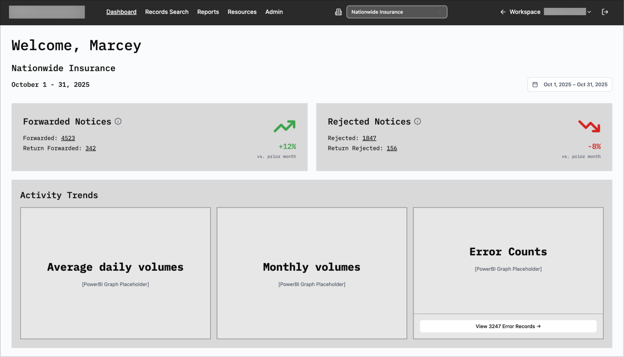
Enhanced Data Visualization surfaced critical metrics directly on the dashboard using PowerBI integrations, so users could understand performance at a glance rather than digging through multiple screens to find it.
Simplified Account Navigation made it easy for users managing multiple accounts or entities to switch between them quickly. No hunting through menus required.
Throughout, we leveraged our client’s existing design system to ensure the redesigned product felt cohesive, modern, and consistent within the broader product ecosystem.
The Outcome: More Than a Redesign
The designs were delivered ahead of schedule and received enthusiastic approval from the product management team. But the impact went beyond a cleaner interface.
Baseline for Future Development
For the first time in the product’s history, the team has a documented, comprehensive understanding of their users including their workflows, their frustrations, and their priorities. That research baseline not only informed this redesign, but will also help inform every product decision going forward.
Repeatable Project Framework
Perhaps the most telling signal of success was that sister product teams within our client’s company have already expressed strong interest in replicating this exact process for their own modernization efforts. A methodology built for one product is now becoming a repeatable project framework for the organization.
That's the thing about creating intentional groundwork with a user focused approach. You can build the foundation for everything that comes next.
Ready to uncover what’s holding your product back and how to move forward? Let's talk.

 Initial Alert
Get in Touch
We'd love to see how we can make an impact for you. Let us know what you're working on.